The Mercedes-Benz logo is one of the most instantly recognizable symbols in the world. Seen on the hoods of luxury sedans, sporty coupes, and even on the track, the three-pointed star commands respect and admiration. But what does it actually mean? Understanding the logo’s history is essential to understanding the brand’s soul.
The Original Daimler Logo: Land, Sea, and Air
Before the merger that created Mercedes-Benz, Gottlieb Daimler’s company, Daimler-Motoren-Gesellschaft (DMG), used a simple oval logo. However, in 1909, the company adopted the iconic three-pointed star as its official emblem. The concept was inspired by a postcard Daimler had once sent to his wife, where he marked the location of his house in the suburb of Deutz with a star. His sons, Paul and Adolf Daimler, later developed this into a corporate symbol. The three points represented the company’s ambition to produce engines for land, sea, and air—a vision that proved remarkably prophetic as Mercedes-Benz engines would eventually power boats and aircraft.
The Benz Laurel Wreath
Before the merger, Benz & Cie. had its own iconic logo: a laurel wreath surrounding the word “Benz.” The laurel wreath was a classic symbol of victory, harking back to the company’s numerous motorsport successes. It was a powerful, proud emblem that represented the company’s competitive spirit and engineering dominance.
The 1926 Merger: Uniting Two Icons
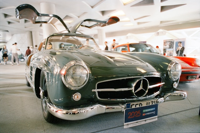
When Daimler and Benz merged in 1926, the logos were combined. The new emblem featured the three-pointed star of Daimler encircled by the laurel wreath of Benz. Below the wreath, the name “Mercedes-Benz” was proudly displayed. This combination created a badge that symbolized the strengths of both founding companies—innovation and victory, engineering and heritage.

The Modern Logo: A Streamlined Icon
Over the decades, the Mercedes-Benz logo has undergone several refinements. In the 1930s, the logo became more streamlined, often appearing without the laurel wreath. By the 1980s, the star was often presented in a simple, clean circle with a silver finish, the version most familiar today. The modern logo embodies clarity, precision, and timeless elegance.
The Star in Different Positions
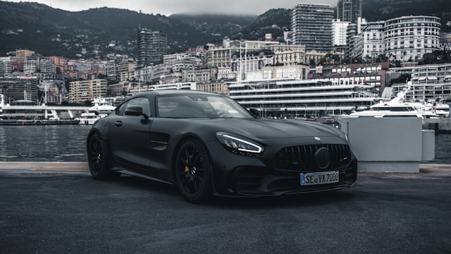
Interestingly, the three-pointed star appears in two primary positions on Mercedes-Benz vehicles. It sits proudly atop the hood on more traditional models, serving as a hood ornament that has become a hallmark of the brand’s classic luxury. On sportier models, the star is integrated into the center of the grille, creating a more aggressive, modern, and aerodynamic look.
The Star as a Brand Promise
The three-pointed star is more than just a design. It is a promise of engineering perfection, safety, and prestige. Today, as the brand pivots toward electric vehicles with its EQ lineup, the star remains a constant, signaling that even in a new era, the values that made Mercedes-Benz great remain unchanged.